A Hillside Honey
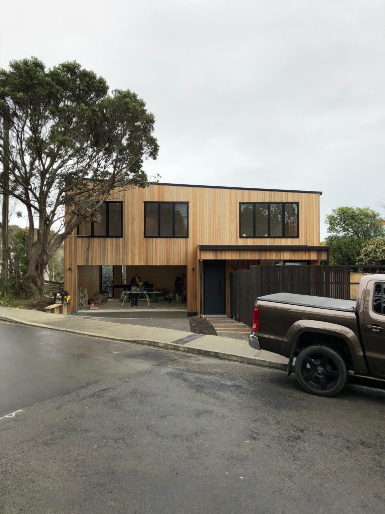
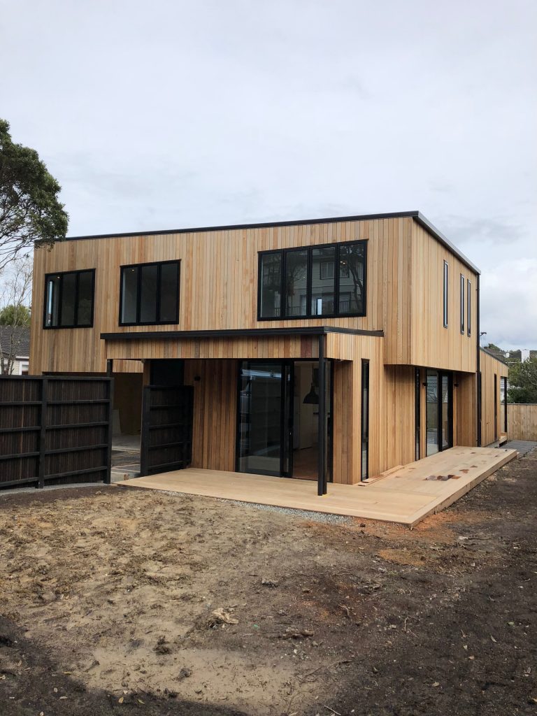
Building in the midst of suburbia means there will already be kerb-side greenery and gardens to soften any architectural intervention, but it comes with its own particular challenges. When Box™ was approached by clients with a 466-square-metre hillside section in Khandallah, Wellington, one priority for architectural graduate Tim Hogarth was to deliver plenty of room to breathe for a family of five, but not in an ostentatious way that completely dominated the site. “We chose to create a double-level home using two volumes, stacked in a plus shape,” says Tim. This ‘+’ configuration helps to reduce the visual scale of the house and allows overhangs from the top floor to shelter the living below. “The house has an interesting geometry, the stacked volumes allow the building to have a dynamic shape from every angle, and offers different views directions over the valley from the upstairs rooms.”
The material palette both inside and out has been streamlined: it’s simple yet smart. Externally, vertical cedar cladding is countered by black aluminium joinery and a black long-run metal roof. “We used a roofline that slopes at the lowest-possible pitch to keep the appearance modern, and stained the cedar grey, using a stain colour that is designed to intentionally speed up the silvering of the timber – a look the owners wanted,” says Tim.

Issues of privacy from neighbours were dealt with by including floor-to-ceiling glazing at ground level where light floods in, and by using carefully placed slot windows in the four bedrooms upstairs. These frame slices of suburbia – a snapshot of a cottage-clad hillside or a cabbage tree in the next-door garden.
Inventive room configuration makes full use of the footprint. Just beyond the front door, a cedar screen carves some separation from the main living zones beyond. The busy family (two physicians and their three children) can spread out in the interconnected dining/living/kitchen/flexi rooms downstairs, while upstairs are four bedrooms and a landing. The landing has been optimised with space for a desk, “it is located just beneath a window so the occupants can glance out at the neighbourhood while they work or study,” says Tim. The main bedroom is a private retreat with a walk-through wardrobe that leads to the ensuite.

Before construction began, a humble cottage, with some unsympathetic alterations, was removed. The owners repurposed some beautiful kauri floorboards from the original home, and Box™ sourced extra flooring to match, so it runs through the entire downstairs area. The owners had another interior request, “they wanted the kitchen to accommodate a retro Smeg refrigerator they had become excited about,” explains Tim. This ice-cream-blue fridge with its chrome accents fits in seamlessly with the cabinetry, in white and pale pine, so the room becomes a Scandi-chic showstopper. What’s not on show is the scullery, “we used timber jambs around the bi-fold doors in a tall cabinet so no light gets through from the scullery, which is behind. First-time visitors have no clue the room is there,” says Tim.
Close collaboration with clients always makes for a better finished design, and this project was no different. In the living area, a unit was custom-designed to house both the TV and the owners’ collection of books. “They were measured so we knew they would fit,” says Tim. A wood-burning fireplace, low-E glazing and thermally broken joinery were included for when the windy city lives up to its name. Timber decking wraps around the north, west and eastern elevations, enabling a myriad of options for a barbecue and a craft brew when the sun shines.

