The Power In Colour
When it comes to colour, Pantone is the undisputed global leader on providing insight into the science and emotions of the spectrum. And it is that time of year – the Pantone Colour Institute’s colour experts have been at it once again, scouring the world for new colour influences, taking notes on clothing, cars, film, new artists, even travel destinations and socio-economic conditions, leaving no stone unturned in predicting palettes that might win consumers over in the fields of fashion, beauty, design, home décor and more.
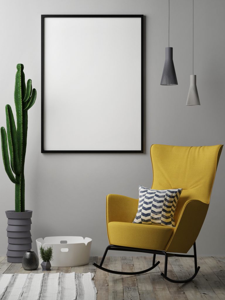
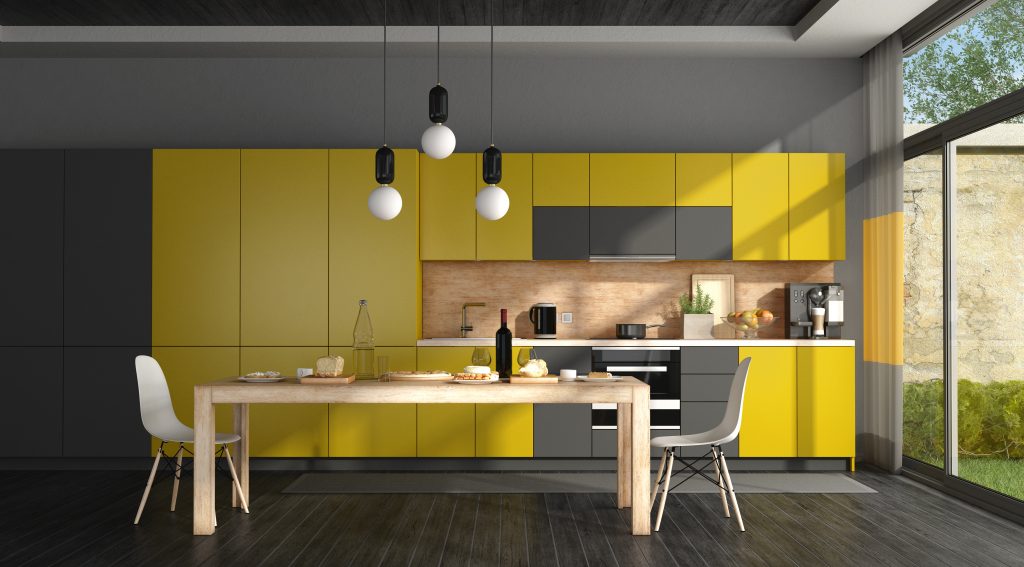
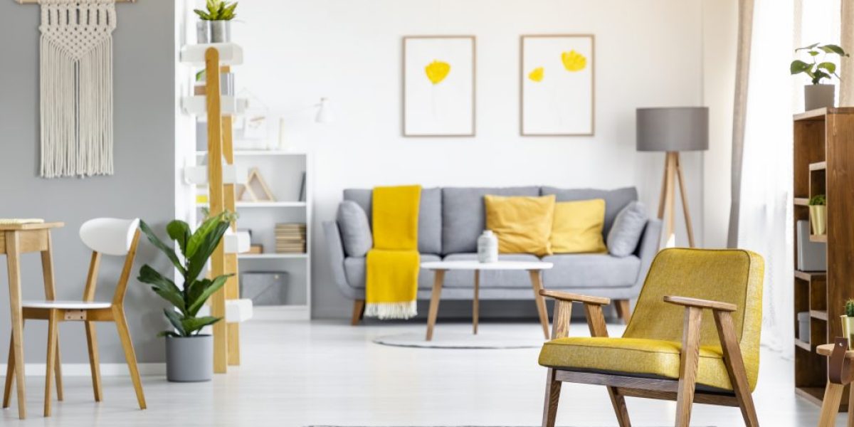
In revealing their annual forecast of the hue that will best embody the year ahead, the connoisseurs of colour have whipped up not one but two shades for its 2021 Colour of the Year. A classic, neutral mid-grey called Ultimate Grey – Pantone 17-5104 – conveying “feelings of composure, steadiness and resilience” according to their press statement and a vibrant yellow dubbed Illuminating – Pantone 13-0647 – associated with optimism and vivacity.
The Colour of the Year for 2020 was Classic Blue. Though a serene shade offering a sense of reassurance, and announced weeks before the first Covid-19 cluster was discovered, the selection was nevertheless eerily prophetic. Alongside Vice President of the Pantone Colour Institute Laurie Pressman stating, “It’s a colour that anticipates what’s going to happen next,” it was a shade used for medical scrubs around the world.

As for the 2021 shades, it is the first time a grey has taken the honours and just the second time that two colours have been selected together in the Colour of the Year’s two-decade history, the first rare occasion being in 2016, which saw the unveiling of soft hues of pink and blue in Rose Quartz and Serenity. It is also the only other time a vibrant yellow has been highlighted, next to 2009’s Mimosa, which could have been read as intimating a sense of hope as the Great Recession of 2008 shaped North and South America and Europe.
According to Pantone, 2021’s pale mid-grey – described as “dependable” by Pressman – paired with the bright pop of canary yellow, were selected as they represent “a marriage of colour conveying a message of strength and hopefulness that is both enduring and uplifting.”
Pantone describes Illuminating as “a bright and cheerful yellow sparkling with vivacity, a warming yellow shade imbued with solar power.” Ultimate Gray, on the other hand, is “emblematic of solid and dependable elements, which are everlasting and provide a firm foundation. The colours of pebbles on the beach and natural elements whose weathered appearance highlights an ability to stand the test of time, Ultimate Gray quietly assures, encouraging feelings of composure, steadiness and resilience.”
The Twitterati, however, might need a little more convincing with some calling out the combined shades as symbols for hi-vis vests and road markings, and one user going so far as to state the selection of colours as “a devastatingly abysmal reflection of capitalism, screaming sickly urban melancholy, a brutalist facade, cold sunshine and cement.” Vogue described it simply as “really weird – just like everything else right now.”

Pantone though begs to differ. “The selection of two independent colours highlight how different elements come together to express a message of strength and hopefulness that is both enduring and uplifting, conveying the idea that it’s not about one colour or one person, it’s about more than one. The union of an enduring Ultimate Gray with the vibrant yellow Illuminating expresses a message of positivity supported by fortitude,” said Leatrice Eiseman, Executive Director of the Pantone Colour Institute. “Practical and rock solid but at the same time, warming and optimistic, this is a colour combination that gives us resilience and hope. We need to feel encouraged and uplifted, this is essential to the human spirit.”
Colour has long been known to play a role in influencing emotions, perceptions and behaviours. Perhaps in the wake of what has been a tumultuous year, the Pantone Colour of the Year, in reflecting what is taking place in our global culture, will more than ever be viewed as “expressing what people are looking for that colour can hope to answer,” said Pressman. “As society continues to recognise colour as a critical form of communication, and a way to symbolise thoughts and ideas, many designers and brands are embracing the language of colour to engage and connect.” If anything, we might draw upon the quiet reassurance and resilience of Ultimate Grey to ride out these uncertain times, alongside its counterpart suggestive of sunshine and optimism in looking forward to a better, brighter – illuminated even – tomorrow.

