It Takes Two Baby
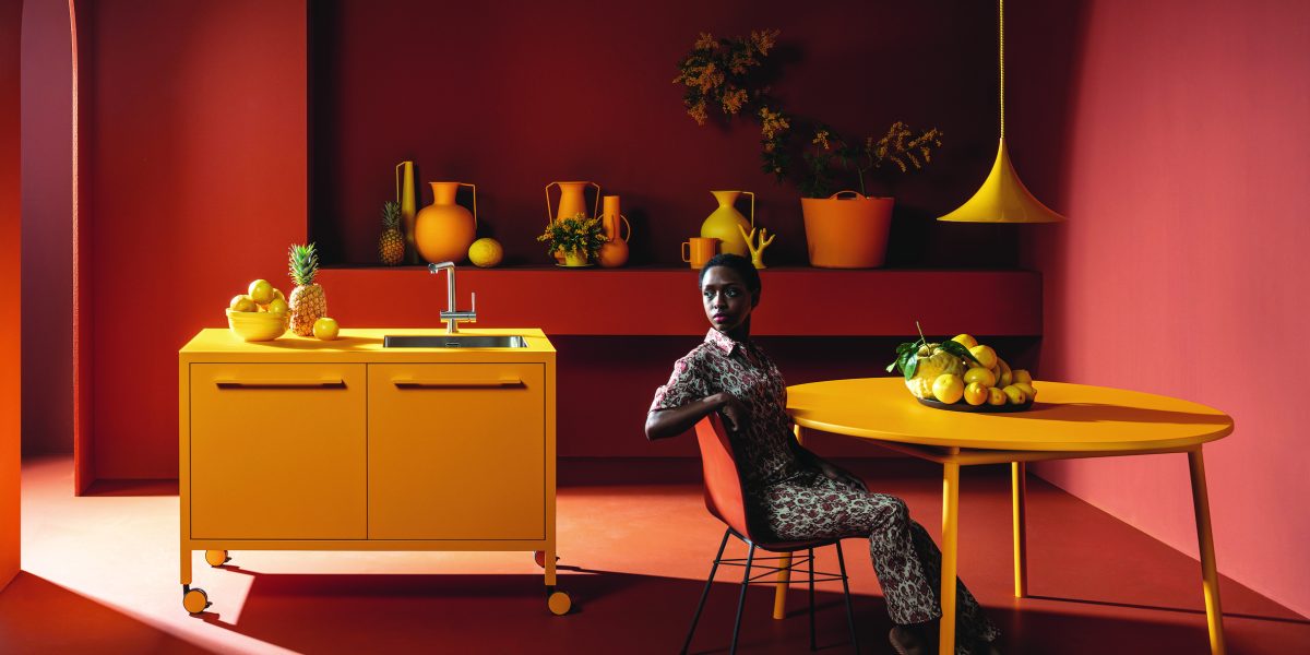
In a bold tango between colour and form, the Cucina Frame by FANTIN makes bright mustard yellow and terracotta brown look like they’ve always been best friends. The room is a masterpiece of contrast, with the deep, earthy tones of the walls providing a warm embrace to the sunny pop of the kitchen units and table.
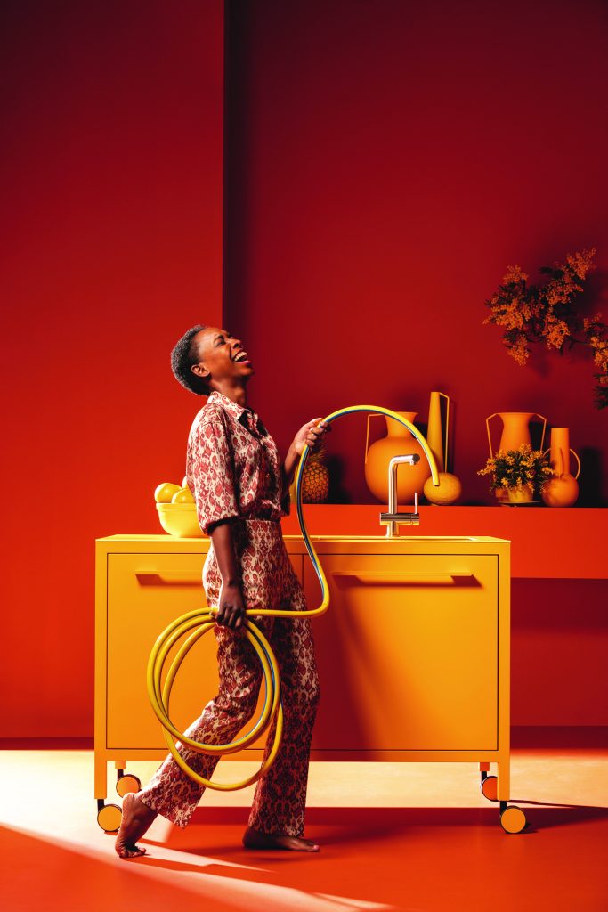
The squared-off, minimalist lines of the cabinetry offer a grounded, modern look, while the collection of artfully placed vases and foliage suggests that even the most utilitarian spaces deserve a bit of glamour. Who said a kitchen couldn’t be the star of the show? When it comes to going bold with colour matches, the key is confidence. If you’re pairing striking colours, like the mustard yellow and terracotta seen in the Cucina Frame, pick shades that evoke warmth or contrast dramatically. It’s all about balance: a deep, earthy background allows the vibrant foreground to shine without overwhelming the senses. Don’t shy away from unexpected combinations; they can create spaces that feel dynamic and full of personality. The trick is to commit. Let one bold colour dominate, and use the second to accentuate it, creating harmony rather than chaos. Add a few neutral elements like metal frames or glass tops to ground the look—so your kitchen doesn’t feel like a runaway circus (unless, of course, that’s the vibe you’re after).
Colour match: Resene Celebrate 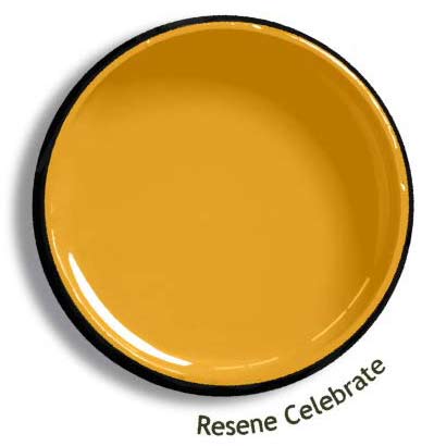
Chill in the Green Room
In this striking scene, FANTIN plays with shades of forest green, creating an immersive, almost serene environment. The richness of the green cabinetry and shelving contrasts beautifully with the vibrant orange floral accents scattered throughout the space, proving that nature’s own colour palette can be your best designer.
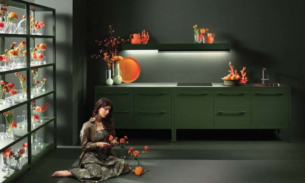
The seamless integration of a glass-top surface and hidden LED lighting enhances the depth of the monochromatic look while maintaining a minimalist vibe. The space is an ideal example of how layering tones within the same colour family can create a calming, yet visually impactful kitchen. The pops of orange in the décor give the room a fresh energy—like autumn leaves scattered in a deep forest. It’s a bold, refreshing statement that lets the kitchen itself do the talking, while still leaving room for a bit of playfulness. Plus, it’s a good reminder that sometimes, less really is more. Especially when ‘less’ is gorgeous green.
Colour match: Resene Seaweed 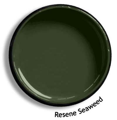
I’m Blue Da Ba De
In this sleek scene, cool, calming steel blue of the cabinetry serves as the perfect canvas for playful pops of yellow.
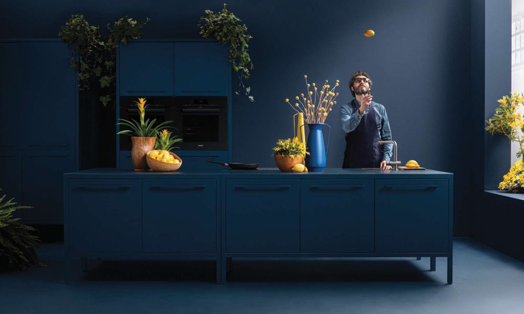
The bold choice of complementary colours—blue and yellow—works wonders here, proving that opposites really do attract.” For those thinking of dabbling in complementary colours, here’s the trick: let one be the star (hello, steel blue!) and let the other provide the fun flourishes (those lemons know what they’re doing). By keeping the yellow as an accent in decor and plants, the space remains balanced, not blinding. Don’t forget to mix in textures too—the smooth metal finishes contrast perfectly with the soft, organic shapes of the accessories. Alright, who’s for a gin & tonic?
Colour match: Resene Zinzan 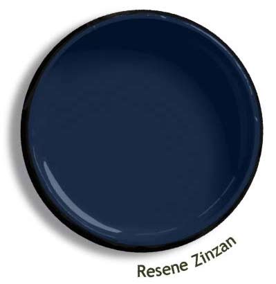
For more information visit safarigroup.co.nz/augustus-park-parnell/

