Milan – The Capital Of Global Design
Each year, more than three hundred thousand creators, designers, architects, creative geniuses and global media descend on the Italian city of Milan for the city’s annual Design Week, combining the Salone Internazionale del Mobile design exhibition and the Fuorisalone’s events and installations across the city’s different Design Districts. Lauded as one of the world’s most important design events, it’s the inspiration for the products, people to watch and trends that will be dominating the world of interiors over the coming year.
The scale of the week long showcase (9th-14th April 2019) was astounding – there are over 2,350 exhibitors spanning acres of halls at the Salone and more than nine different Design Districts to explore across the city and its outskirts. Alas, it is impossible to see it all, but during my week in Milan I absorbed a breathtaking amount of inspiration from the best creativity on offer in the design industry from furniture, lighting, décor and more.
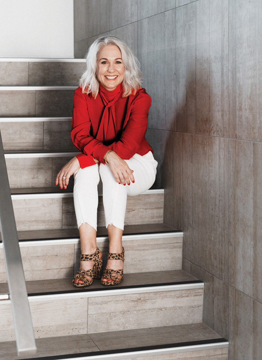
North Shore interior designer Kirsten Ford made her way to Milan to attend the prestigious Salone Internazionale del Mobile design exhibition, as the New Zealand winner of a global design competition.
Known as the ‘Oscars of Design’, the 58th annual Milan furniture fair is one of the biggest on the global design calendar and where the biggest international designers reveal what they will be launching in 2019/20. And reveal they did and who better to share her thoughts about the key trends and the Salone Internazionale del Mobile experience in Milan than interior designer Kirsten Ford.
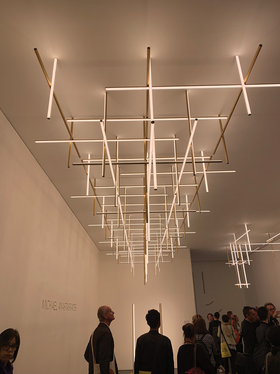
Coordinates by Michael Anastassiades for Flos
Trendsetting and Highlights
SUNSET PALETTE
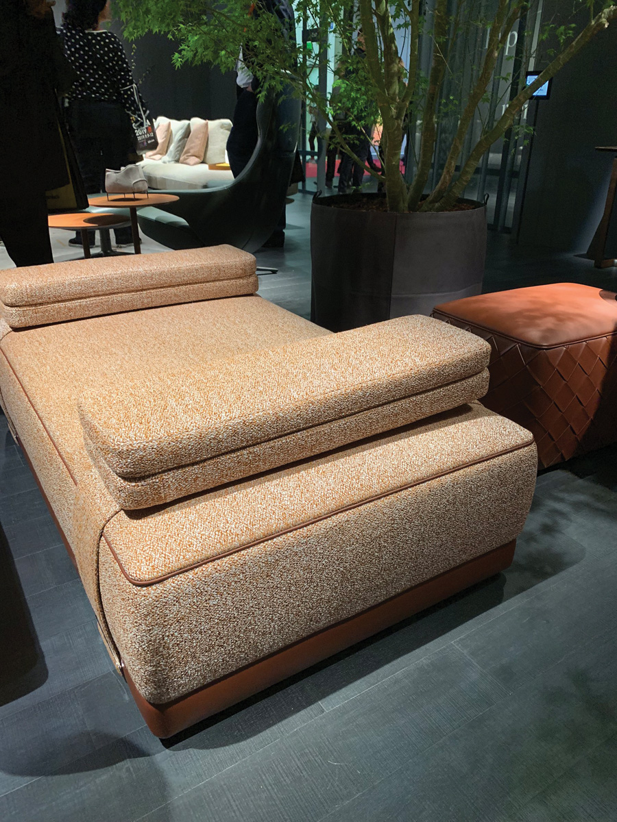
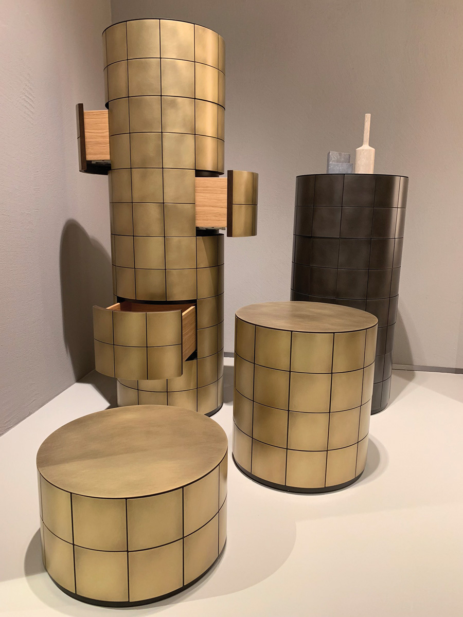
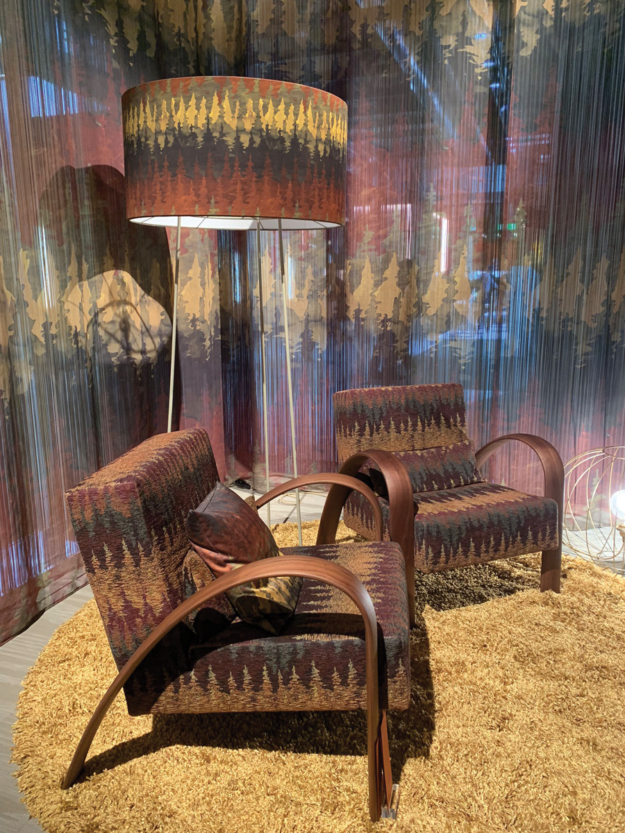
Fashion and interiors are always closely intertwined, and the colour palettes dominating Milan were definitely cued from fashion’s warmer, richer hues. Palettes were rich, earthy and organic – but they were far from muted, instead they were confident, sophisticated and undeniably sexy. Think burnt orange, mustard yellow, burgundy and peach. Evocative sunset palettes and desert tones.
Marmalade, sienna and terracotta were by far the hottest hues. Dusty mauves and inky indigoes were key accents. There were no more shades of grey and blonded timbers have made way for richer, warmer tones.
Iconic European brands Moooi and Missoni both displayed these palettes to stunning effect. Moooi’s Walking on Clouds carpet included hundreds of different tones and shades in a collage of clouds. Missoni’s Salone space, bordered by ombré fringed curtains, showed highly tactile water colour-like fabric patterns inspired by alpine scenery in rich earthy tones, complemented by their distinct zig-zag pattern.
TAILORED DETAILING
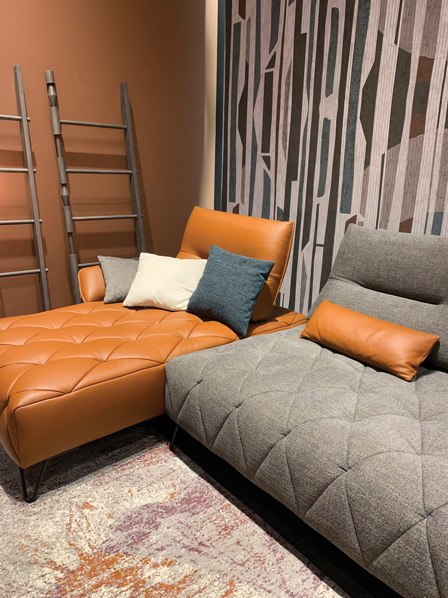
Sofas, seating and cushions at Milan were beautifully detailed with stitched quilting and flanged seams. Fabrics were confidently and expertly contrasted, creating a stylishly eclectic vibe. Fabrics weren’t just upholstery, they were integral to the overall piece of furniture.
Aerre Italia’s diamond quilting was perfectly executed on their modular sofas in a woven fabric contrasted with rich tan leather. The oversized ottomans by Poltrona Frau, inspired by the bold style of actor Carey Grant, blended a range of shapes and materials, unified by a common woven leather base. The buckled detailing was perfect!
The artisan technique of caning was a definite trend, re-imagined in beautiful shapes and forms. Ratan weaves were beautifully showcased by Thonet’s re-edited classics – my favourite being the curved Mos bench, perfect for an entry hall or bedroom.
Metals were beautifully brushed and burnished, not polished. De Castelli’s metal finishes and furniture was one of my favourite stands at the Salone – luxury Italian craftsmanship combined with innovative technology. The Pandora Drawer was the perfect treasure chest!
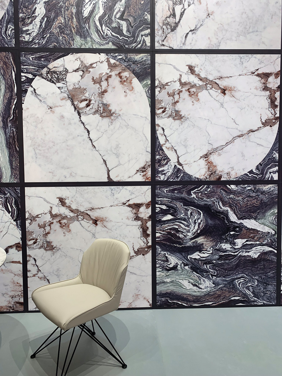
Stones, porcelains and marbles were coloured and richly veined. Cedit’s ceramic tiles had clearly defined Italian flair in beautifully saturated shades inspired by traditional marbled papers, the super larger format slabs intended for feature walls and floors throughout the home, beyond traditional bathroom applications.
ART DECO 2.0
There’s a clear move away from minimalism, and many forms were Art Deco inspired, with more than a hint of the 1920s and 1930s in sweeping curves and brass detailing, themes seen in Milan’s many glamorous Campari bars. Shapes, colours and a mix of lush fabrics create a luxe feel. The traditionally ornate Art Deco detailing has been pared back for a more modern feel. Henge displayed the ultimate in sophisticated Italian craftsmanship. Their pieces oozed timeless luxury with super stylish re-interpretations of Art Deco lines and forms.
MODERN URBAN LIVING
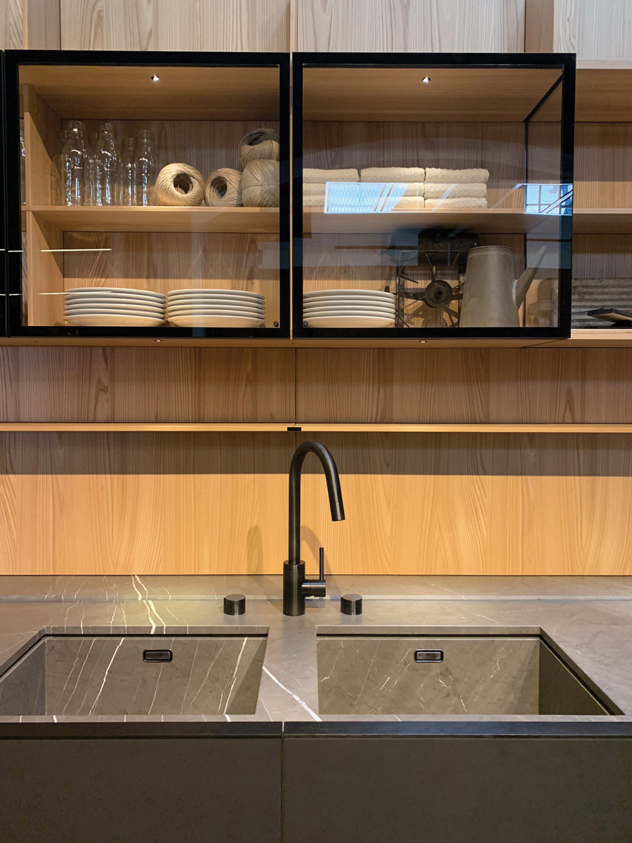
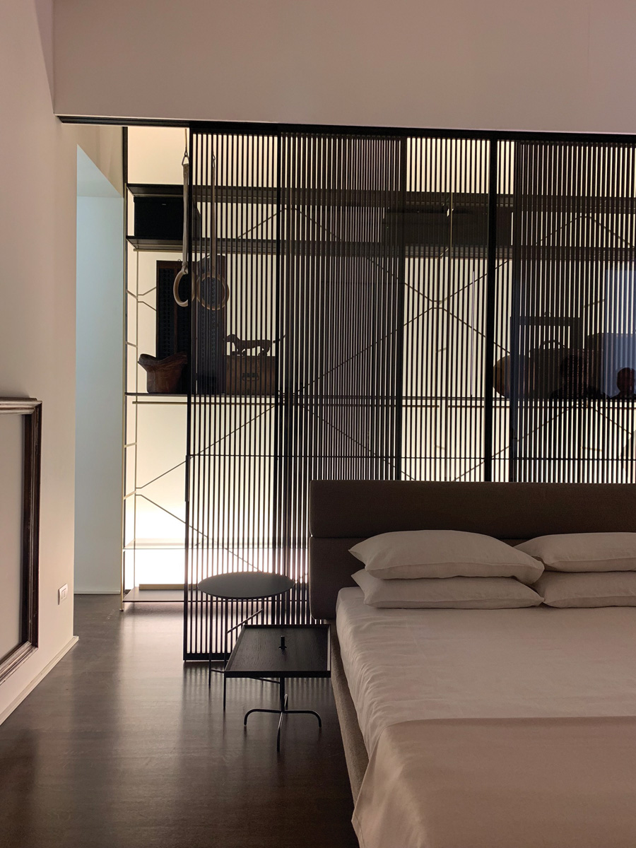
Urban homes are becoming hybrids – common living spaces of kitchen, living and dining are now completely integrated and fused with space for working from home. These multi-function living spaces were beautifully brought to life at the Boffi flagship showroom in the Brera district, featuring living, bedroom, kitchen and bathroom spaces in a gallery-like two story Milanese character building. Kitchen cabinetry seamlessly integrates into living room display shelving, benchtops blur into dining tables, materials were luxe and refined. The wardrobes deserve a special mention – rather than spaces to store items away, they were fully integrated with the bedroom, displaying clothes and shoes with lighting, glass shelving and drawers.
CONTOURED CURVES
Like the colour palettes, silhouettes are warmer, softer and rounder. Shapes are cocooning and lineal architectural lines are combined with softer contours and curves that create a visual flow, making spaces feel calmer and more organic. But the modern take is about balance – the softer shapes are contrasted with strong angles for a more sophisticated and less feminine feel.
For me, one of Patricia Urquiola’s stand out pieces at Milan was the Gogan sofa for Moroso. Inspired by Japanese stones that have been polished by wind, water and time, the sofa looked both sculptural and irregular, like a carefully balanced stone sculpture. I also loved how the boucle fabric mirrored a river stone, but also cleverly made the seams in the upholstery disappear.
GREENERY
Every installation and display was beautifully accessorised. And the accessory of choice? Without a doubt, indoor greenery. The inclusion of plants and trees was yet another example of nature’s inspiration and was used to add visual interest and soften many different schemes. Of course, greenery comes with the benefit of being a natural air purifier and stress-reliever. But it also provides an organic beauty to any space.
LIGHTING AS AN ART FORM
This year the Salone also hosted Euroluce, a bi-annual lighting exhibition. There was is a trend for hero feature lighting, art forms in their own right. A favourite was a spectacular modular and sculptural piece by Michael Anastassiades for Flos – simple in concept but perfectly formed.
ECO DESIGN
There was a clear trend for new ways to use recycled materials. Designers are creating different and new materials based on recycling and alternative technologies – a pleasing balance between nature and technology. I loved the initiative of Danish brand Mater who re-issued their classic 1955 table and chair using recycled ocean plastic waste.
Milan Design Week Must Dos
 TO EXPERIENCE
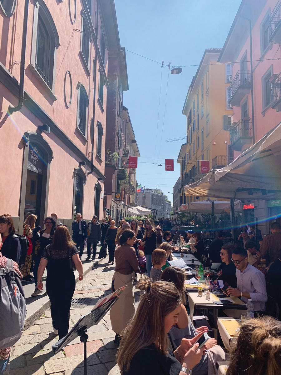
By definition, Brera is the artist’s quarter. During Design week, the narrow, cobbled streets of this Design District are transformed into an open-air hub of performances, installations and exhibitions. There are more than nine different Design Districts but to us the inter-twined relationship between the everyday street life and architecture of Brera with more than 150 design installations made this an incredible experience.
TO DINE
Tom Dixon has been a highlight of Milan Design Week for many years and now he has created a permanent installation in the city with the opening of The Manzoni, which will also be his first dedicated showroom in mainland Europe. Three new collections were showcased for the opening – my favourite being “Spring” – a series of pendant lights made from ribbons of stainless steel, creating beautiful swirling patterns of light. This was one of the most in-demand dining experiences in town so book a table well in advance.
TO SHOP
10 Corso Como has been called the mother of all concept stores, a wonderful place to explore an expertly curated avant-garde collection ranging from fashion, to jewellery, homewares and beautiful books on art, architecture and design. There’s also amazing espresso at the garden terrace. When you’re there, make sure you head up to the top floor for a view over Milan’s rooftops.
TO INDULGE
Warning – for anyone even slightly fashion addicted, Milan is rather dangerous! For a serious fix of designer brands at discounted pricing, I can highly recommend the Serravalle Designer Outlets on the outskirts of Milan – a village style shopping outlet with a gorgeous selection of major Italian brands from Gucci (my definite favourite), Prada, Versace, Dolce & Gabbana and many other iconic international brands. My top shopping tip – take your passport with you to get the documentation necessary to claim your tax back at the airport.

Moooi Walking in Clouds
TO SEE
No one should leave Milan without having seen Leonardo Da Vinci’s The Last Supper, his largest and often regarded greatest artwork. Housed in the convent of Santa Maria delle Grazie, the painting was finished in 1498 and has a rich history, including “miraculously” surviving a World War II bombing. Entries to view the masterpiece are hard to come by and strictly timed, so make sure you book well in advance.
TO BE
In all the crowds, rush and sensory-stimulation of Design Week, I think one of the best things one can do is simply to sit outdoors in Milan’s April sun, to have time to contemplate and reflect – while enjoying an aperitivo of course, preferably an Aperol Spritz.
Following your passion
Kirsten Ford said farewell to the corporate world after a 15-year career to follow her dream and passion for all things interior design. She has never looked back and admits she has never been happier!
Kirsten Ford Design is a boutique, full service interior design studio located on Auckland’s North Shore, working with clients nationwide. Specialising in new builds or full renovations, Kirsten Ford Design works with busy clients, their architects, builders and trades from concept to completion of your finished home.
After a 15-year career in marketing and management positions in the corporate world in both Auckland and London, Kirsten was keen to move into an industry that blended the business skills she had learnt with the creative inspiration she had from the time spent living in Europe. Designing and building two family homes sparked a real passion for interior design and after completing the Diploma of Interior Design from New Zealand’s Interior Design Institute in 2015, Kirsten decided to follow her dream, launching her own business in 2016.
“Dreams do come true! I’m thrilled to have been selected by the judges to attend the event in Milan, it is a dream for any interior designer, especially after three years with my own business, and it was an incredibly rewarding experience and to be in the company of so many design superstars was surreal.”
