QT Auckland – Designing Immortality
Australian designer Nic Graham established his own interior design studio Nic Graham & Assoc. in 1998 with a focus on the hospitality, commercial and high-end residential sectors. His close knit team of architects, technical craftsmen and landscape designers, who frequently collaborate with local artists, crafts people, florists, graphic and fashion designers and even chefs, have honed a contemporary signature aesthetic evoking a sense of warmth and comfort that is underscored by bold use of colour, quirky graphics and a strong influence of art. This, married with a hands-on passion for the finishing details of each project, has gone on to be celebrated in many notable hospitality and residential collaborations across Australia and the Asia Pacific region, including a burgeoning partnership with QT Hotels following the award-winning completion of QT Hotel Sydney in 2012. M2 Magazine caught up with Nic to talk about his latest collaboration: QT Hotel Auckland, which has just won the 2021 Paul Davis Award for the Best Refurbishment in Australasia, his creative process and the secret to immortality.
What was the moment that determined your passion for interior design?
I don’t think there was a defining moment as such, I always had a passion for design and art and fashion as a youngster and used to drive mum mad by changing the furniture in the house regularly. It wasn’t until my second year of design school that I realised I might actually be good at it… not just because I was a good illustrator, but I had a wild imagination.
Can you remember the first space that really made an impact on you?
I always loved going to the National Gallery of Victoria, a space designed by Roy Grounds. It had a cathedral-like function hall with an illuminated stained glass ceiling and the bluestone clad entry lobby with sheer walls of glass and water running down the face.
How do you kick-start the creative process when it comes to luxury hotel design?
I always start with the narrative first and look at how I can tell a story through design and how it may enhance a guest experience. I question the natural light, the architectural volume, and in most instances, how to expose the raw shell, onto which we can project a polished layering of materials.
Can you talk us through your creative process of designing the interiors of QT Auckland? How did you approach this project and what was your design vision?
On my first trip to Auckland, it was a freezing cold day, the ocean was a deep green-grey and the site of the soon-to-be hotel was a fairly nondescript office building waiting to be converted into something uniquely QT. After two martinis and a dozen of Auckland’s finest oysters, it was revealed to me how treasured the oyster is in New Zealand, and rightly so. The idea of the rough outside and seductive polish of the inside was a nice metaphor for a repurposed inner city building and hotel conversion – a shell hiding the luxury that lies within.
The oyster narrative is a loose one, but extends to some interior components that we used such as wall textures, bold polished colours, bespoke rugs and carpets, and graphics and artworks that celebrate Auckland’s DNA and the mythical sea surrounding the land of the long white cloud.
Do you have a favourite space within the hotel? Or a particular aspect about this project that you love?
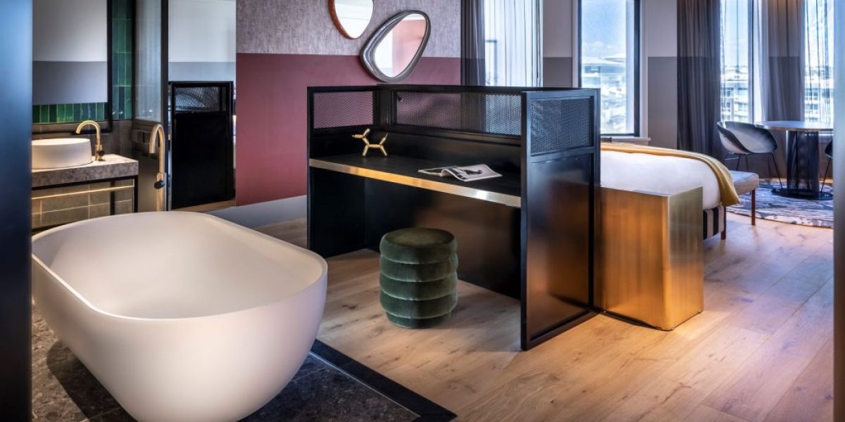
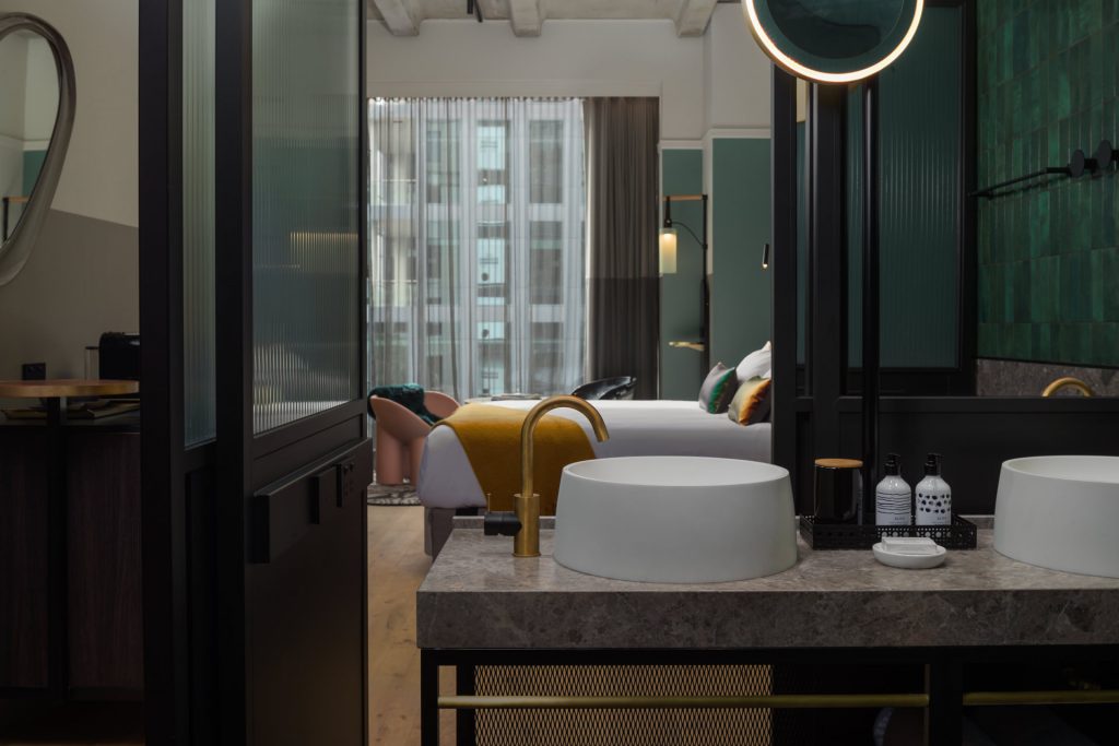
We were lucky to have a client who supported our vision for creating many visual moments in the hotel. I actually love the guest rooms. They have more design per square metre than any other QT completed before. The bold use of colour is comforting, especially in the filtered afternoon or morning sun… and I love the way the black frame ribbed glass doors to the bathroom slide away to reveal the underwater green tones of the bathroom tiles. The rooms with the exposed concrete ceiling are also a great reminder of the previous use of the building.
What was the most challenging aspect of bringing this project to life?
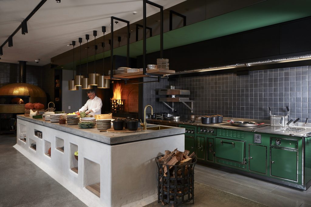
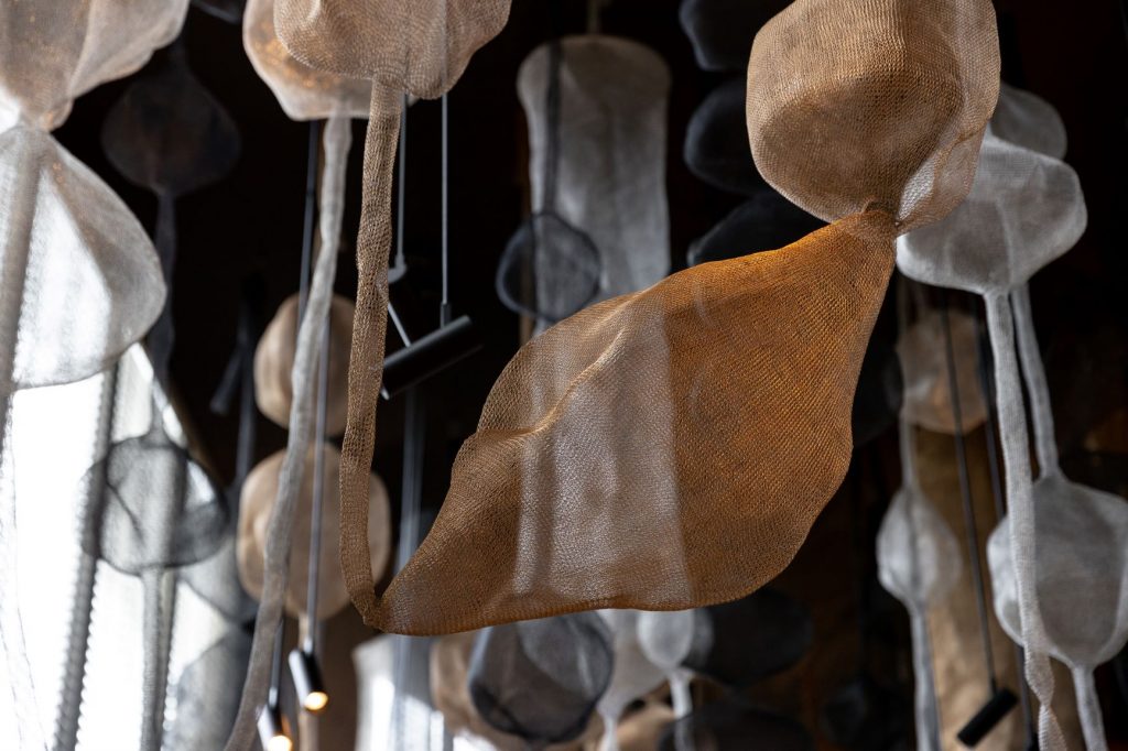
As QT Auckland is the tenth QT Hotel in the group, this is the only one where, due to COVID, we were unable to conduct weekly site visits. The beauty of the team behind this brand is that they understand that design evolves during the course of the project. Remaining flexible is the key when projects are under time pressure. It was stressful not being able to visit during construction, but we also became quite efficient in speedy design resolutions due to Covid-related delivery delays and availability worldwide of materials. We were even directing the placement of accessories and the hanging of the wire sculptures in the signature restaurant, Esther, via FaceTime and a glass of wine.
You have designed several QT Hotels & Resorts across Australasia. How does keeping a sense of place factor into your design process?
Building the DNA of QT hotels started eight years ago in Australia’s Gold Coast, where we combined vintage quirk with a modern twist, and a strong sense of locality. We always try to deliver a contemporary story that has vintage influences across building design, graphic design, accessories, art and furniture.
We interpret this differently for each property, reflecting their local surrounds. QT Queenstown brings to life après-ski and the year-long outdoor sports scene, bringing bold ski jackets and active wear patterns to aspects of the interior, and QT Wellington has an iconic art gallery theme as a nod to the creative capital. QT Auckland aptly celebrates its harbourside setting – whilst not far from the viaduct and the yachts, we didn’t want a nautical theme, but rather something more interesting and complex.
While each QT carries a common design-led thread, every hotel is certainly a character in its own right.
How would you sum up the Nic Graham & Assoc. Aesthetic?
Definitely eclectic, colourful and bold, and graphic with a strong influence of art. We also have the privilege to be able to design and manufacture bespoke furniture, light fittings, rugs and wallpapers due to our wonderful collaborators.
In your opinion, what does the future of luxury hotel design look like?
Smaller spaces designed for more intimate experiences. Details that are hand-finished and crafted by local contributors. Surfaces that are easy to keep hygienic. User-friendly technology.
What advice would you give to those who are inspired by design into their own projects?
Select carefully, minimise the number of materials in one space, design for longevity but understand that a plasterboard wall can always be repainted and a sofa always reupholstered in the future if you need a fresh change. Invest wisely in art that you love, in furniture that is well-made and comfortable and above all, brings happiness to your life as opposed to bringing envious smiles on your neighbours’ faces.
If you were to have a life motto, what would it be?
One that I quote from an ancient Vedic aphorism says, “Infinite flexibility is the secret to immortality.” When we cultivate flexibility in our consciousness, we renew ourselves in every moment and reverse the aging process. Perhaps not to be immortal, but to teach oneself to be more flexible in design, construction, and in life in general may reduce our overall stress of life.
What has been your career highlight to date and what do you still aspire to achieve?
I feel I am privileged to have designed so many wonderful projects for loyal clients, like QT. A highlight is always to show my family and friends the results of my sleepless nights and devotion to my craft.
I would still love to design my own home and guesthouse in the country somewhere… watch this space.
What are some practical ways you’ve noticed that people are using to update design in the home, as a result of the pandemic?
Spending money wisely. Bathroom and kitchen renovations and updating furniture that we spend longer at home sitting in. We take so much more notice of our living environment now that we may work from home more. I think everyone is in love with indoor plants again and understands that turning on all the halogen lights at once doesn’t create a relaxing mood. Lamps, dimmers and scented candles create a necessary calm in times of stress.
What is the most treasured item in your own home?
Apart from my dog, I have a Tom Dixon high back chair upholstered in black horsehair that is by the fireplace and provides many hours of seated comfort whilst reading.
What’s next for you? Is there anything exciting you can share with us?
Our collection of furniture is being launched in a world wide online platform that will allow the general public and design community to access many archived designs from our studio projects.
