Six Tricks With Lighting
Lighting might not take top billing when it comes to the wishlist that will make a space your own, but it is one of the most magical aspects of design – your chance to effect a Tinker Bell moment using the fairy dust of light. When designing for light, some only focus on the practical side – will there be enough of it over the kitchen bench to dice an onion without chopping off your finger, for instance. But there are two sides to this coin: playing with light is also playing with shadow and, as Japanese author and aesthete Jun’ichiro Tanizaki says, “Were it not for shadows, there would be no beauty.” Specialist designers understand how to manipulate the subtleties of light, but here’s a little taster of what it can do:
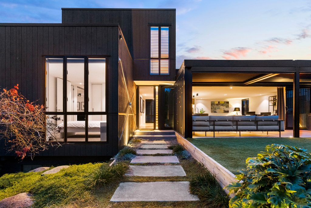
1. Enchanted evenings begin with the right type of light. Sure, cool tones are appropriate for garages and workshops, in areas where task lighting is needed to discern the actual colour of objects or for security lights that make a would-be burglar blink and think twice. But in the entrance to a home, a golden light (about 3000K on the Kelvin scale) will be far more inviting. A wash of light up the walls on approach to an entrance and across the ceiling of the front porch outlines the home as a beacon in the dark and gives visitors a warm welcome.
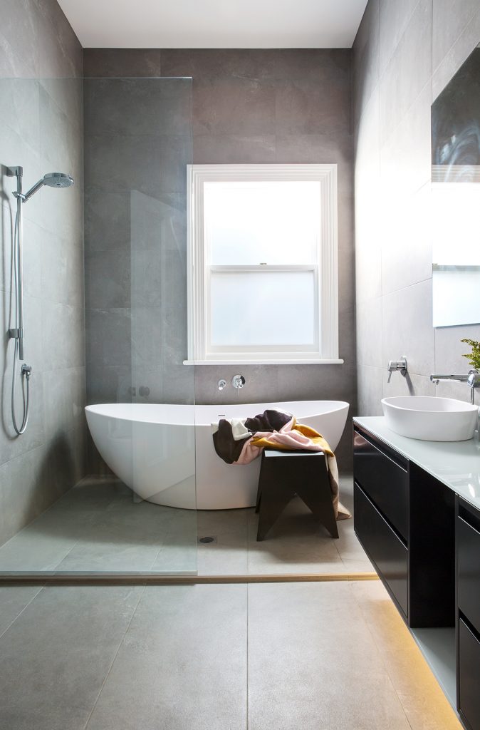
2. Negative detail is a lighting designer’s best friend; it allows LED strip lights to be threaded into architectural features with the result that the lighting is not only hidden but the object is highlighted, often appearing to ‘float’ in the space. There are many applications where this makes a beautiful addition to a room: lighting can be slotted into the juncture where a wall meets the ceiling so the two seem disconnected, between the grooves of a plywood panel ceiling, under a stair banister, the lip of a kitchen benchtop or beneath bathroom cabinetry so the room is softly illuminated from below.
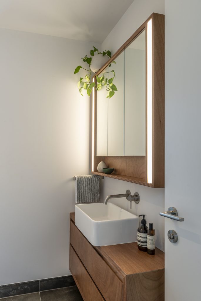
3. Unless you’re a supermodel, or under 30 years of age, you won’t want lighting in the bathroom vanity to be directed from above. Overhead lighting creates scary shadows on the face which, first thing in the morning, can be a shock to the system. Best steer clear of cool light here too – it drains any colour from your complexion which may mean you overcompensate on the liquid foundation. Natural light is optimum but, failing that, use a bulb in a colour temperature that mimics this. For even illumination, a pair of side lights either side of the mirror enhance the artistry of a morning and evening routine; these can even be custom designed into the vanity unit.
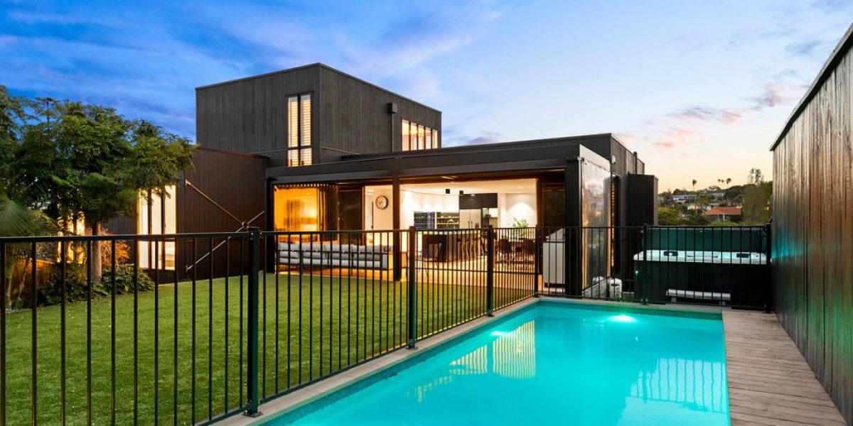
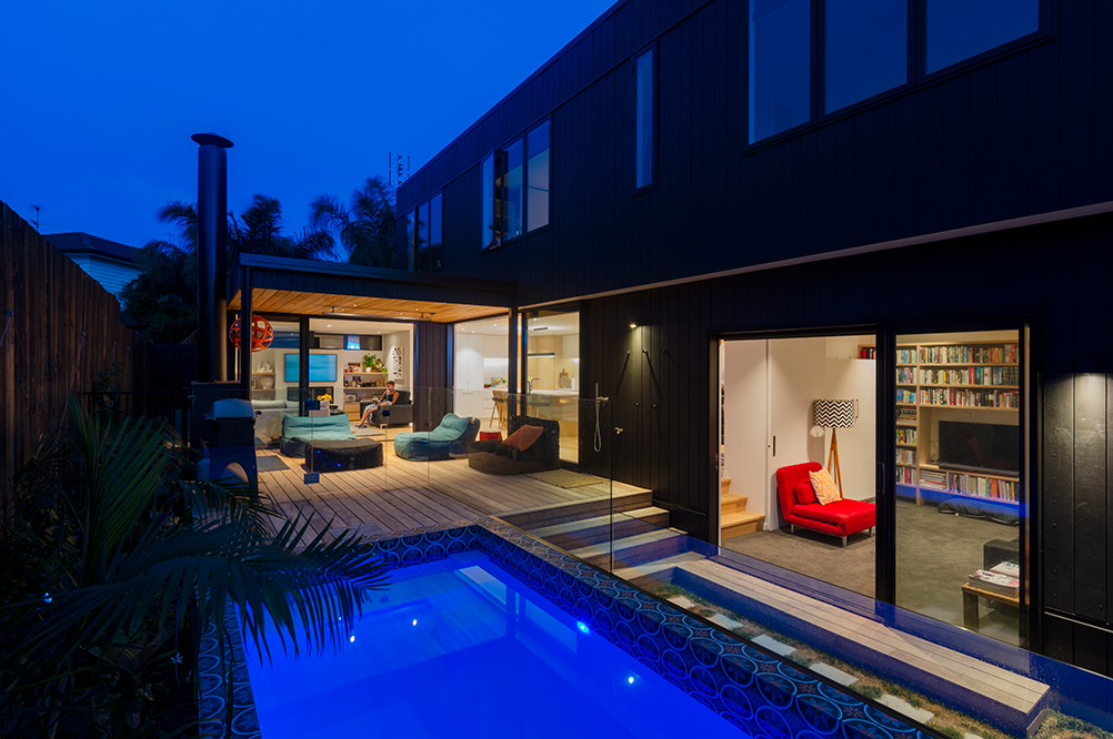
4. Aah the family pool – a place for a mid-summer plunge, a magnet for entertaining, an addition that keeps younger children amused for hours and the teenagers home longer. But at night, without the right lighting, that sparkling, hard-working design feature becomes nothing more than a black hole in the backyard. For glow-in-the-dark good times, get the experts’ advice on lighting that can be concealed beneath the water level and will wash beautifully down the walls. Use in-ground lights around the pool area for safety and spotlights directed onto trees and foliage to transform the suburban space into a tropical paradise.
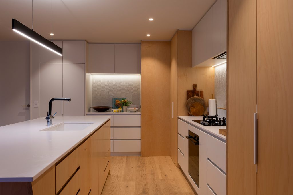
5. If you’ve invested in a tile that’s a talking point for your kitchen splashback, dial up the design conversation by using strip LEDs under high cabinets to wash down onto it – an asset in setting the mood for dining and entertaining. Task lights above the island make life easier and although three pendants are still popular, slimline linear pendants, that can be customized to length, are the obsession of the day: you’ll need a high-wattage for food preparation but make sure it’s on a dimmer for the dinner-party.
6. When working with your lighting designer, always mention items that you think deserve to be highlighted as the main event. Spatial design benefits from a focal point and lighting can create this by using a narrow beam to draw attention (similar to the way a roaring fire has such natural magnetism). You might pick out a painting on the wall, highlight the coffee table in the centre of a room, or zone in on a piece of sculpture off to the side. Whatever you choose, that’s okay – it’s personal – but be singular in your selection. Too many ‘heroes’ dilute the experience.
Visit Box™’s website for more lighting ideas.
