Make The Most of Your Front Door
Entrances that entrance and entice don’t just happen by happy accident. There are some design tricks that will make the most of your home’s front door; the first opportunity to impress.
Colour It Confident
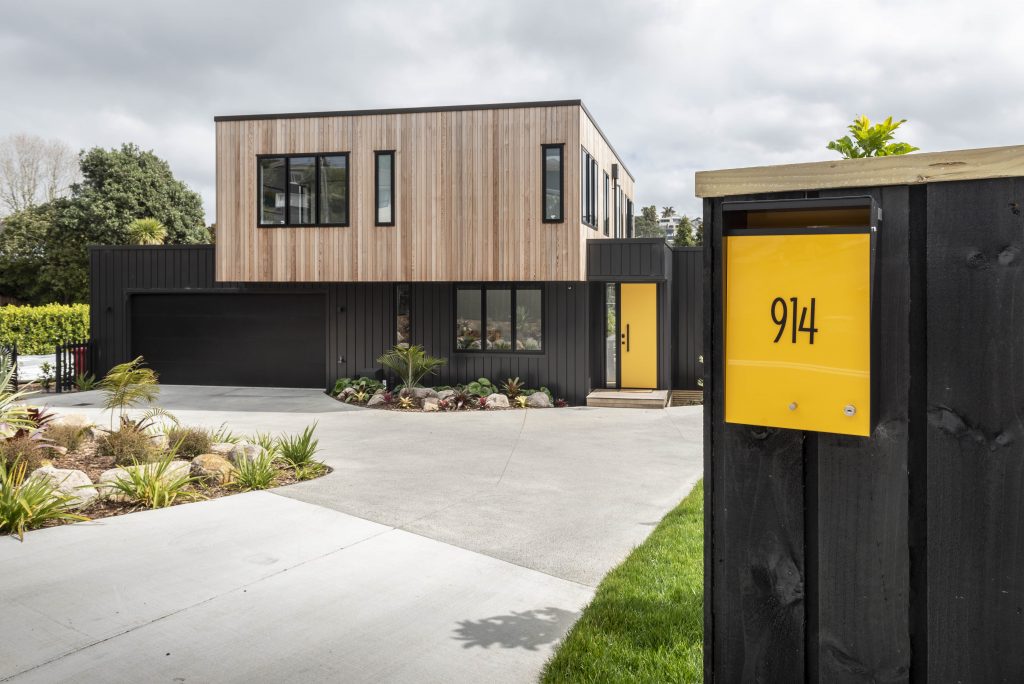
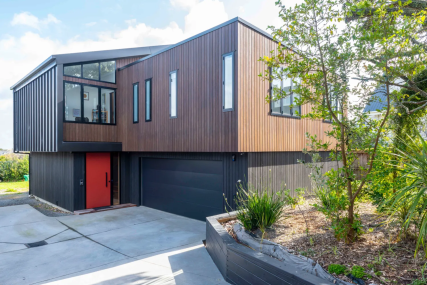
Weatherboards and other cladding materials tend to be either dark or light, so it’s almost obligatory in our minds, that you make some noise with the front door. That’s what the California modernists advocated – and we’d agree. A bold red, a sunshine yellow or a retro orange are the colours favoured by Box™ clients but don’t be afraid to choose a shade that is personal to you. We often find that the colour choice of the door becomes the cue for artwork in the entrance hall – or it could be the other way around. Also, don’t miss the opportunity to finish the door with a strong, sculptural handle that is not just easier to pull shut, but a contemporary statement. Even small touches, such as a letterbox that matches the shade of the front door, can make a big difference to that first impression.
Amp Up Or Slow Down
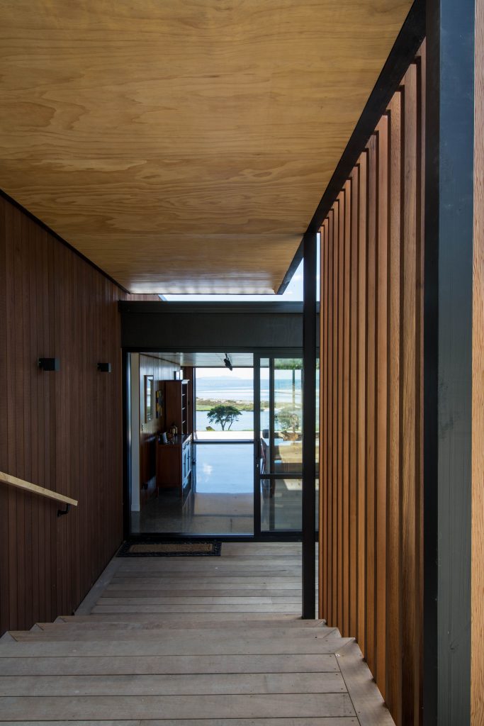
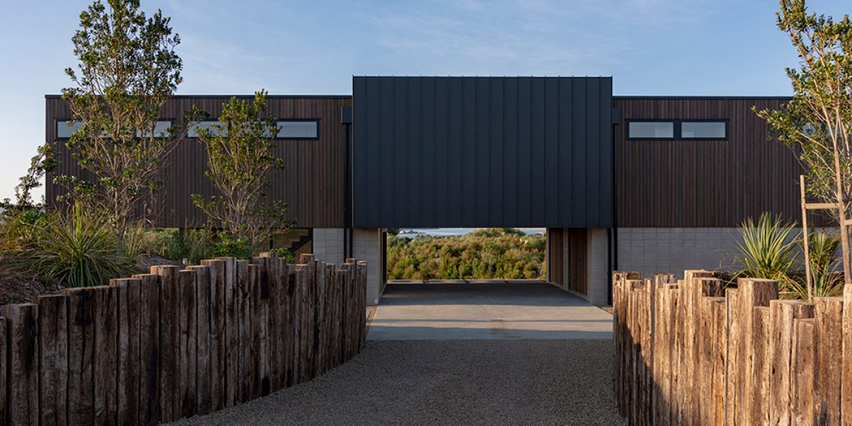
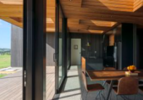
An entrance can either frame a view – to focus the eye – or it can shield it, so that the stop-you-in-your-tracks moment, when all is revealed, is delayed. In one home on the Tara Iti Peninsula, the carport, punched out beneath the body of the house, becomes a 3D frame that concentrates the view of bush and sea, making it look like a painting. Another Northland home is positioned on the sloping site so that it completely obstructs the vista across the ocean to the horizon from the drive. The pathway to the front door leads down an exterior stairwell, flanked by timber battens, and an enticing glimpse of the sea through glass sliders draws you ever forward.
Lead The Way
Believe it or not, some entrance designs don’t help in wayfinding which means that first-time visitors struggle to locate the front door. That’s okay if you wish to deter any unwelcome door-to-door salespeople (then, by all means, hide it in the carport or around a corner and provide no clear architectural direction), but it’s not so great for friends and family. You could put a traditional pathway from the gate or highlight the entrance by including a porch – or you could do something different. In one Grey Lynn home, the low-key form nestles into the contours of the land, and the black-stained cladding helps to disguise the garage. It’s all rather monolithic apart from one artful touch: a horizontal slash of red on a metal fascia board that contrasts the black timber to indicate where the door is. And it’s painted ‘Pioneer Red’ – a colour that relates historically to the colonial red oxide used on villas of the period, of which there are many in this area.
A Driving Factor
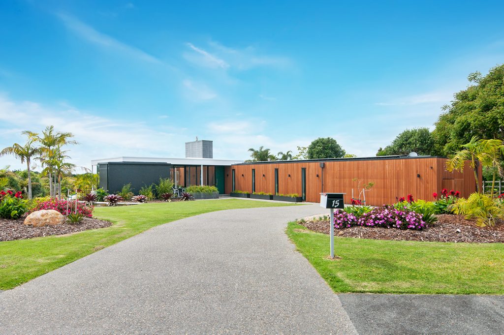
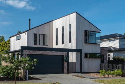
Speaking of garages, where possible Box™ likes to keep them away from the front of the home. No one ever waxed lyrical about the beauty of a garage door – ever – so, if there’s the opportunity, we’ll plan the footprint to move the vehicle entry off to the side, rather than ruin the first impression and the street appeal. If this isn’t possible, keeping the cladding on the main building and the internal garage the same goes a long way to making that unlovely feature simply disappear.
Plant The Seed
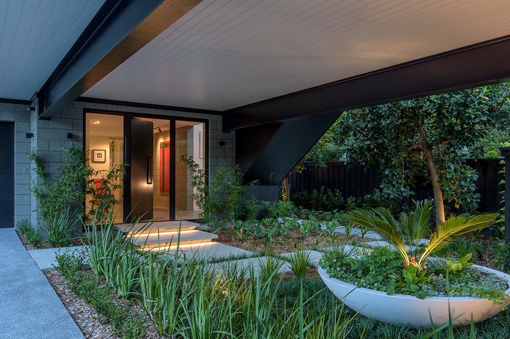
Landscaping plays a starring role in any entrance – think a contemporary take on the avenue of trees. But there are other ideas to explore: bridges and ponds, planters and water features. When working with your architecture or designer, remember to bring your ideas along for this too. In one Box™ project in the Auckland suburb of Westmere, a stormwater drain sat right in the middle of the natural building platform. Box™ slung the main body of the house between two plinths and then designed an entrance courtyard beneath this with tropical plantings to hide the drain. Concrete pavers and a set of steps trimmed with LED lighting make the entrance to this home a journey to remember both day and night.
For more ideas for your entrance way, visit Box™‘s website.
